The museum-going experience... Enhanced
An Interactive app for the Lousiana Museum of Modern Art in Copenhagen.
Exhibitions, Audio Tours, Lousiana Butik, Cafe, Informations.
Working closely with the MOMA Louisiana to co-create an user-friendly app.
This included working on visual design, information architecture, user experience, rapid prototyping,
and delivery of the final product.
Exhibitions, Audio Tours, Lousiana Butik, Cafe, Informations.
Working closely with the MOMA Louisiana to co-create an user-friendly app.
This included working on visual design, information architecture, user experience, rapid prototyping,
and delivery of the final product.
MoMa: Louisiana
The challenge
Museum app nowadays fail to Engage and educate visitors in a meaningful and memorable way.
The Opportunity
To design a museum app lies that creates a personalised and immersive experience for visitors, blending technology with cultural heritage.
The results
Increased visitor engagement
21% boost in visitor numbers (year to year)
Increased accessibility
21% boost in visitor numbers (year to year)
Increased accessibility
Design Principles
Content hierarchy
The app should present information in a structured and organized manner, with the most important information being presented first.
Interactive
The app should incorporate interactive elements such as maps, videos, and audio guides to provide a more engaging experience for users.
User-centered design
The app should be designed keeping in mind the needs and expectations of the users.

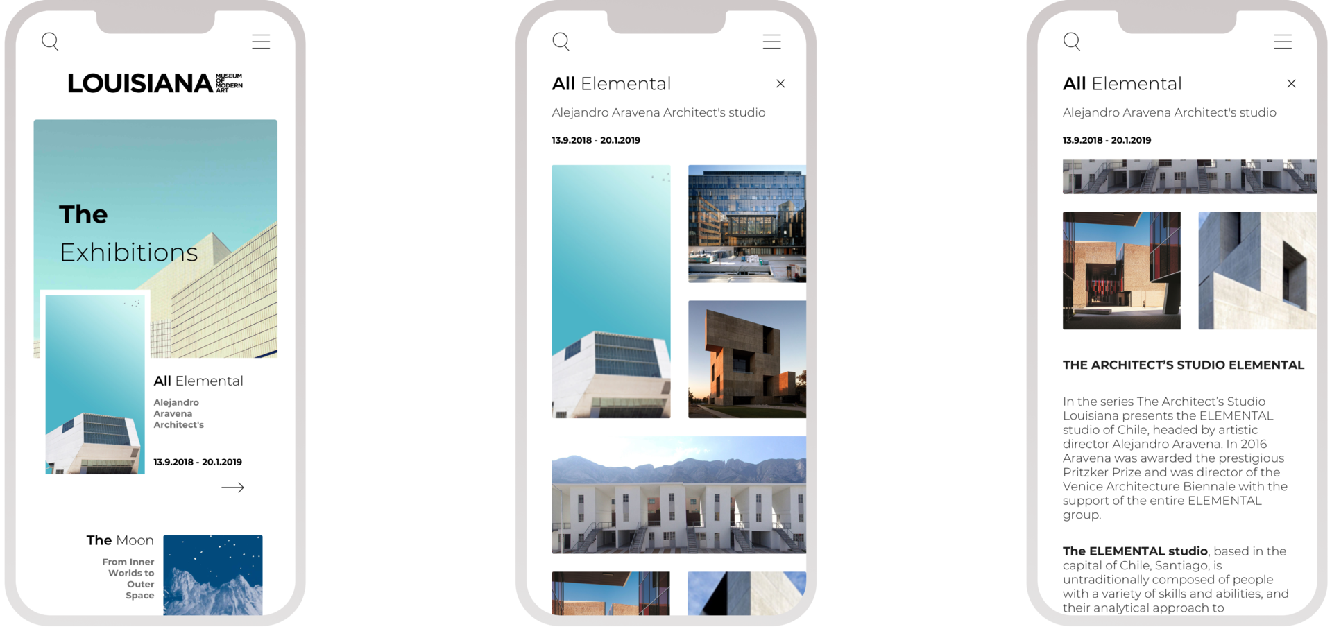
The home screen
Modern and minimal yet effective. A glance at the home page allows users to digest what’s on at the Louisiana MoMa.
Exhibition pages the page displays at first a panoramic of images, user research showed user would identify an artist or an event, and decide if they’d be interested primarily trough images and successively reading a short Bio and description.
Exhibition pages the page displays at first a panoramic of images, user research showed user would identify an artist or an event, and decide if they’d be interested primarily trough images and successively reading a short Bio and description.
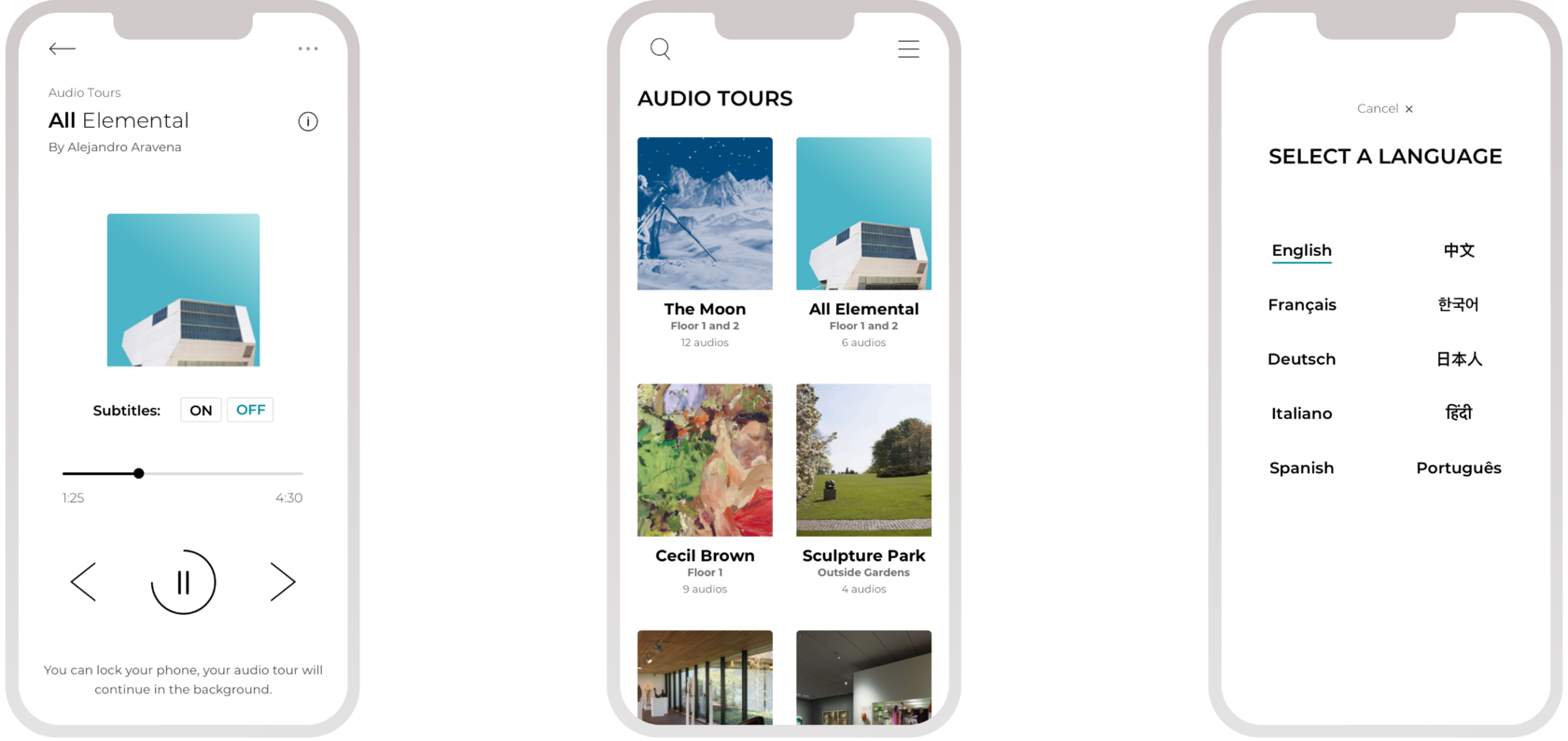
Audio tours
An engaging and visually appealing interface that provides a clear and intuitive navigation system for users to access different audio tour sections and makes the audio tour accessible to a wide range of users, including those with visual, auditory, or motor impairments.
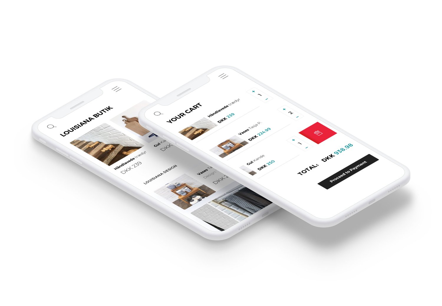
Clean and uncluttered so that it does not overwhelm.
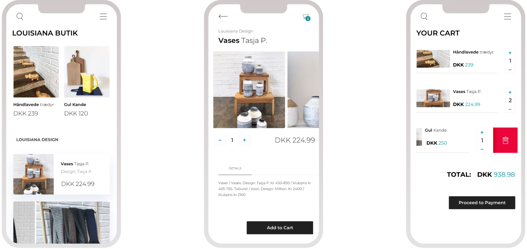
Users are able to navigate through items on sale easily. This helps them make quick decisions about products they want.
A quick slick cart and checkout experience allow user to purchase item quickly, leading to fewer drop-off.
Users are able to navigate through items on sale easily. This helps them make quick decisions about products they want.
A quick slick cart and checkout experience allow user to purchase item quickly, leading to fewer drop-off.
MOMA Butik
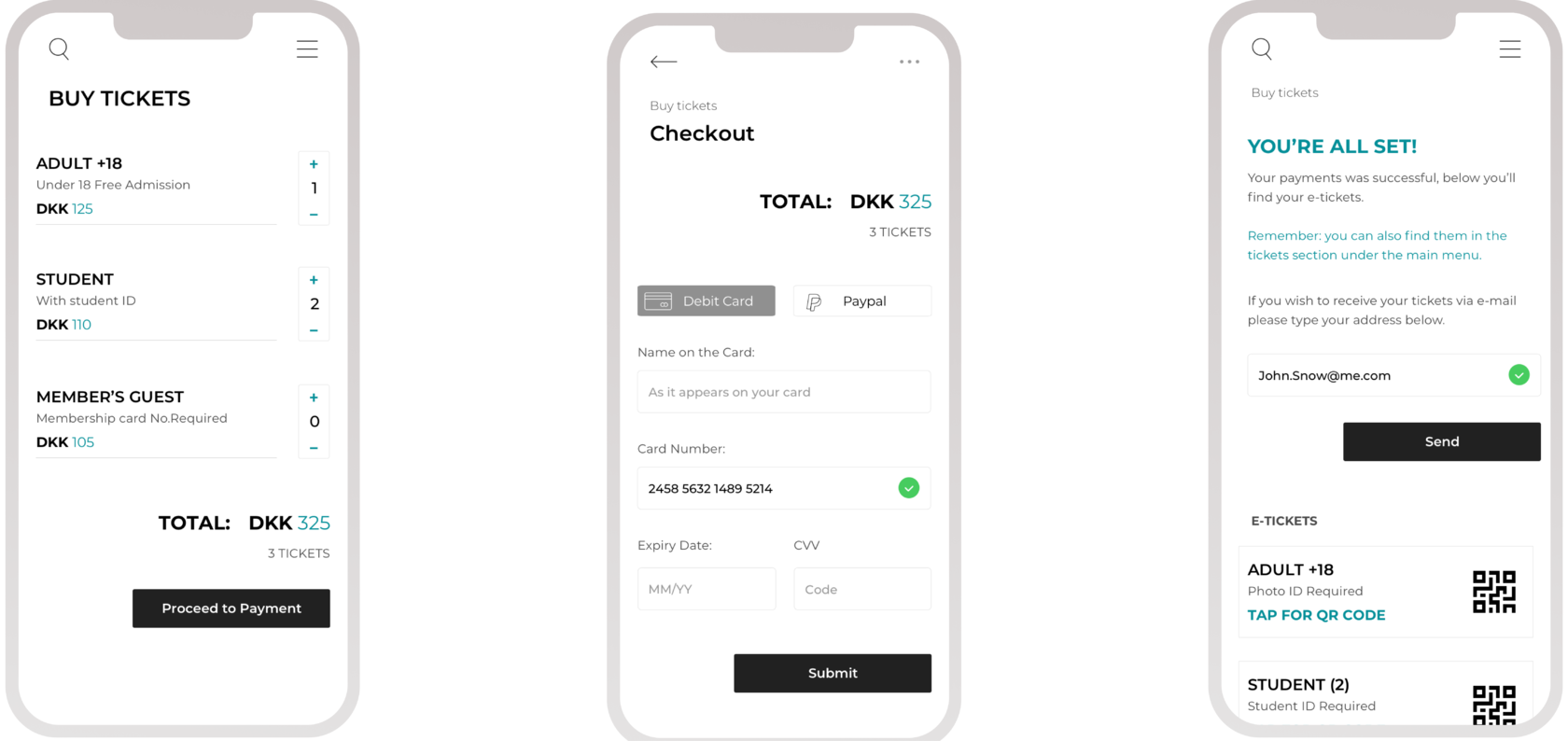
The checkout flow
The ticket purchase process is simple and straightforward, with clear instructions and minimal steps.
Age range options make it easy for users to select the appropriate age range for each ticket, tickets can be stored securely on the device, with an option for users to access their tickets offline, such as by displaying a QR code.
Age range options make it easy for users to select the appropriate age range for each ticket, tickets can be stored securely on the device, with an option for users to access their tickets offline, such as by displaying a QR code.
Next...


